Next.js SaaS Boilerplate: Dashboard, Auth, and Starter Kit with Tailwind CSS and shadcn/ui
Every SaaS starts the same way. Three weeks wiring auth, building a dashboard shell, styling a data table nobody will look at, and arguing about whether settings pages need tabs. None of it is the product. This Next.js SaaS boilerplate covers the scaffold so solo founders and small teams skip straight to the thing they actually care about: app shell with sidebar and topbar, auth screens, dashboard with empty states, settings pages, data tables with keyboard navigation, form primitives with inline validation, and a design token system for light and dark mode.
Starting at $79· 7-day money-back guarantee
Last updated on March 29, 2026


Next.js SaaS Boilerplate: Dashboard, Auth, and UI Foundation
This Next.js SaaS boilerplate is a production-ready UI scaffold designed for modern SaaS apps. It covers the essential dashboard screens, auth flows, and form components every product needs (no bloated templates or design drift). This kit includes:

Core pages and layout
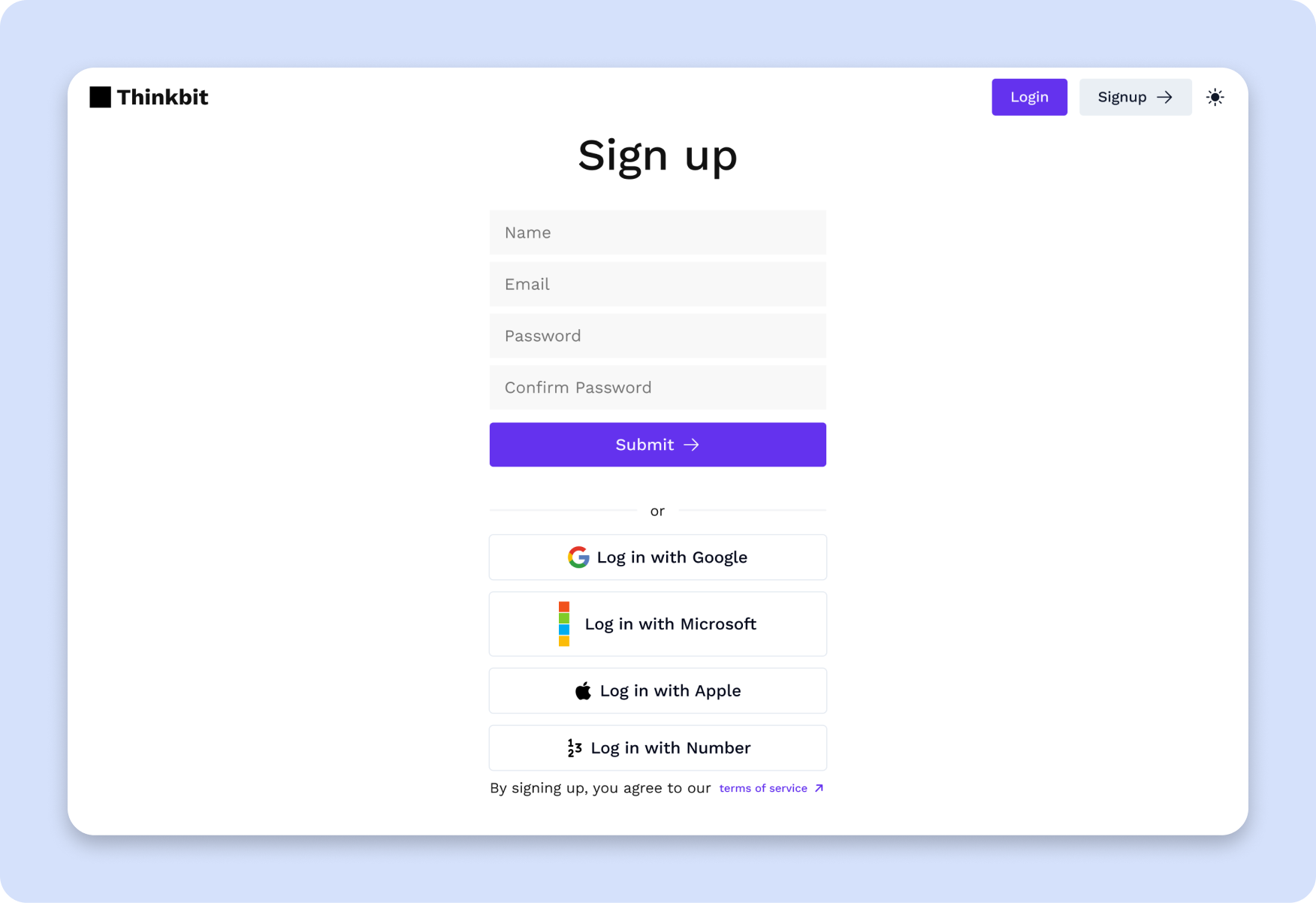
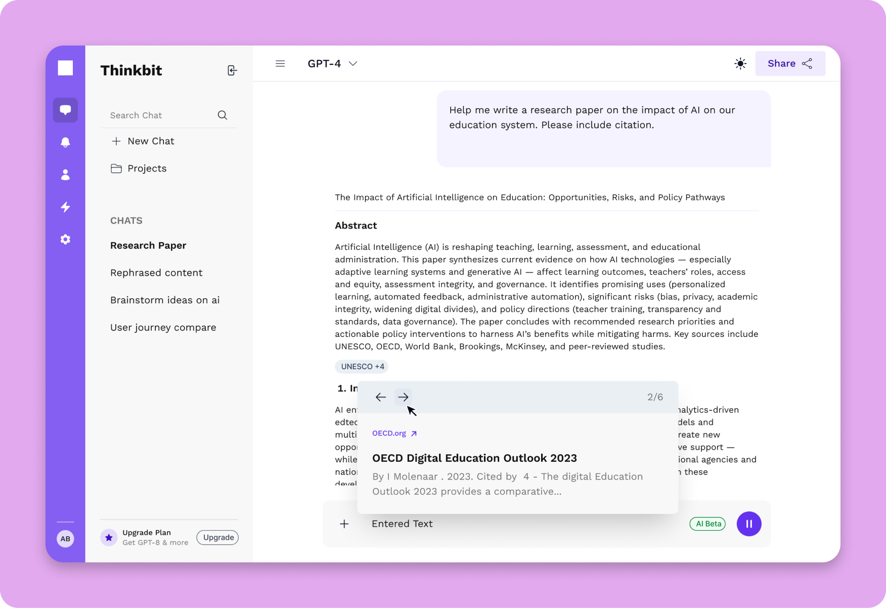
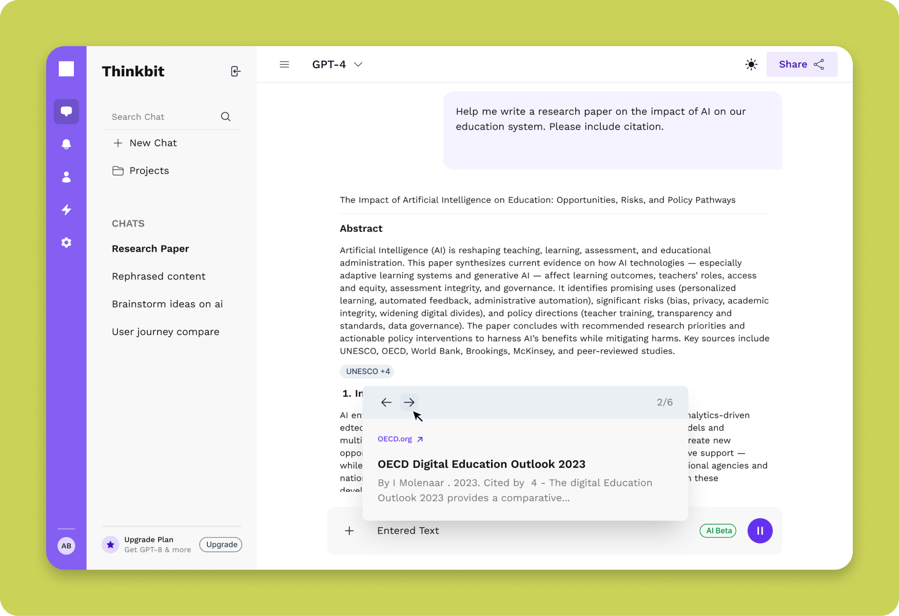
- App layout with responsive sidebar and topbar
- Login and basic auth screens
- Dashboard starter with empty state
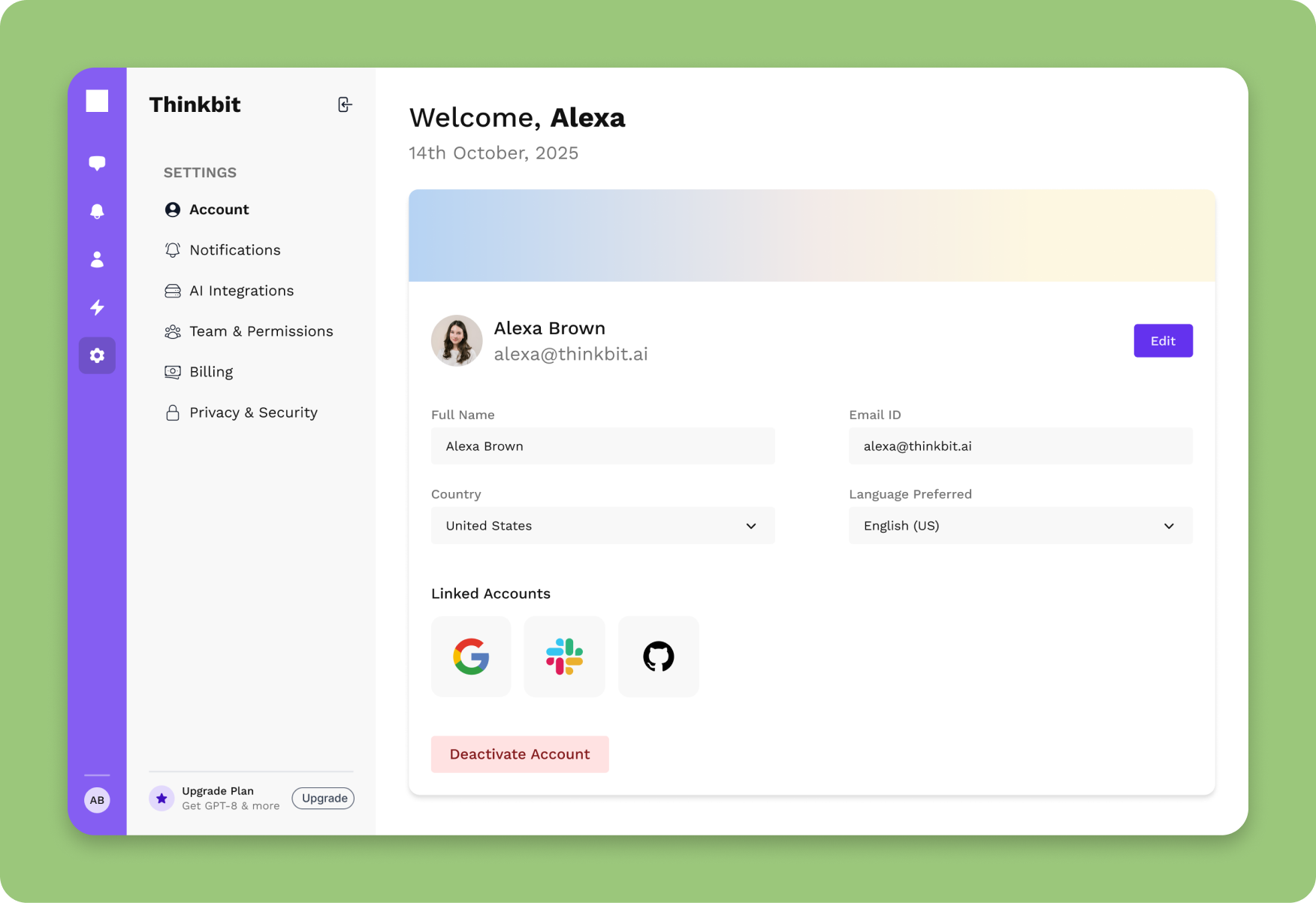
- Settings pages for profile and preferences

Data and forms
- Data table with sorting, pagination, and keyboard navigation
- Form primitives with validation, inline errors, and an error summary

System pieces
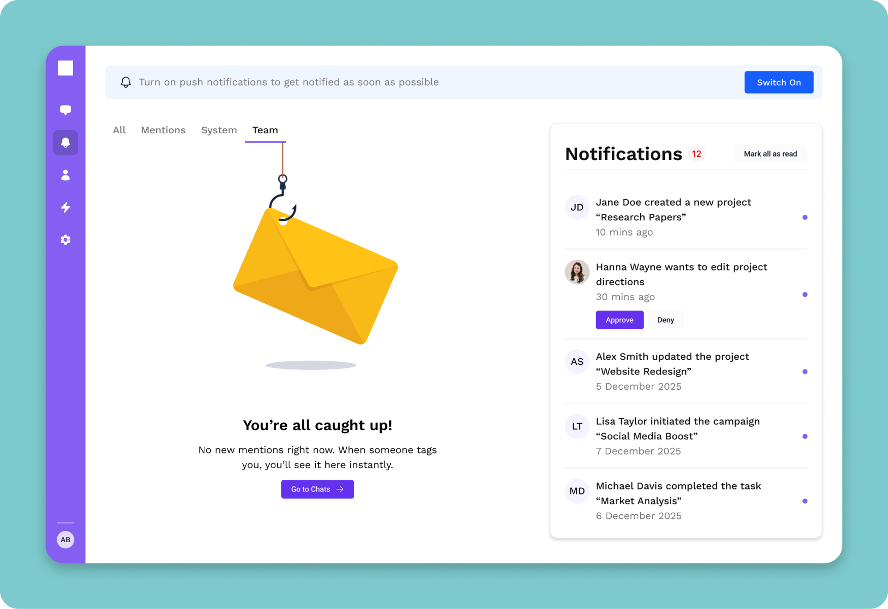
- Toast notifications for success and errors
- Token pack with light and dark mode
- shadcn/Radix primitives wired for accessibility
The AI Feedback Assistant demo uses these exact shell pieces for layout, login, and structure. You can see them working in the live demo
Explore nowWhat's Included in This Next.js SaaS Boilerplate
Included
 React + Tailwind code for the pages and components listed
- Design token system with CSS custom properties
- Example tests and config for a11y on key flows
- 1 year of updates
Not Included
- Backend or auth logic
- Payment processing
- Your model/provider keys
Intent: you get a production-grade UI shell that stands up to accessibility checks and scales with tokens. You wire data and services.
Built for SaaS Founders, Agencies, and Product Teams

Teams building SaaS dashboards or internal tools on Next.js and Tailwind

Agencies that want a repeatable, accessible app shell

Indies who want to go from empty repo to usable UI fast
Note: Not for Marketing sites or no‑code projects.
Foundation the SaaS Starter Is Built On


- TailwindCSS across the auth, dashboard, settings, and team management screens
- shadcn/ui-aligned, so adding more shadcn components later stays consistent
- Radix-backed account menus, team switchers, and settings modals
- oklch design tokens, so a single hue change updates auth, dashboard, and settings screens together
- Server components by default, so client bundles stay under 80KB on the dashboard route
- Drop-in adapters for Supabase Auth, Clerk, or NextAuth, no backend opinions baked in
Accessibility Highlights
Every AI interaction is inclusive by design. Built for everyone, optimized for ease of use.
Preview Gallery
Preview the Next.js SaaS dashboard template screens, accessible and ready for production.
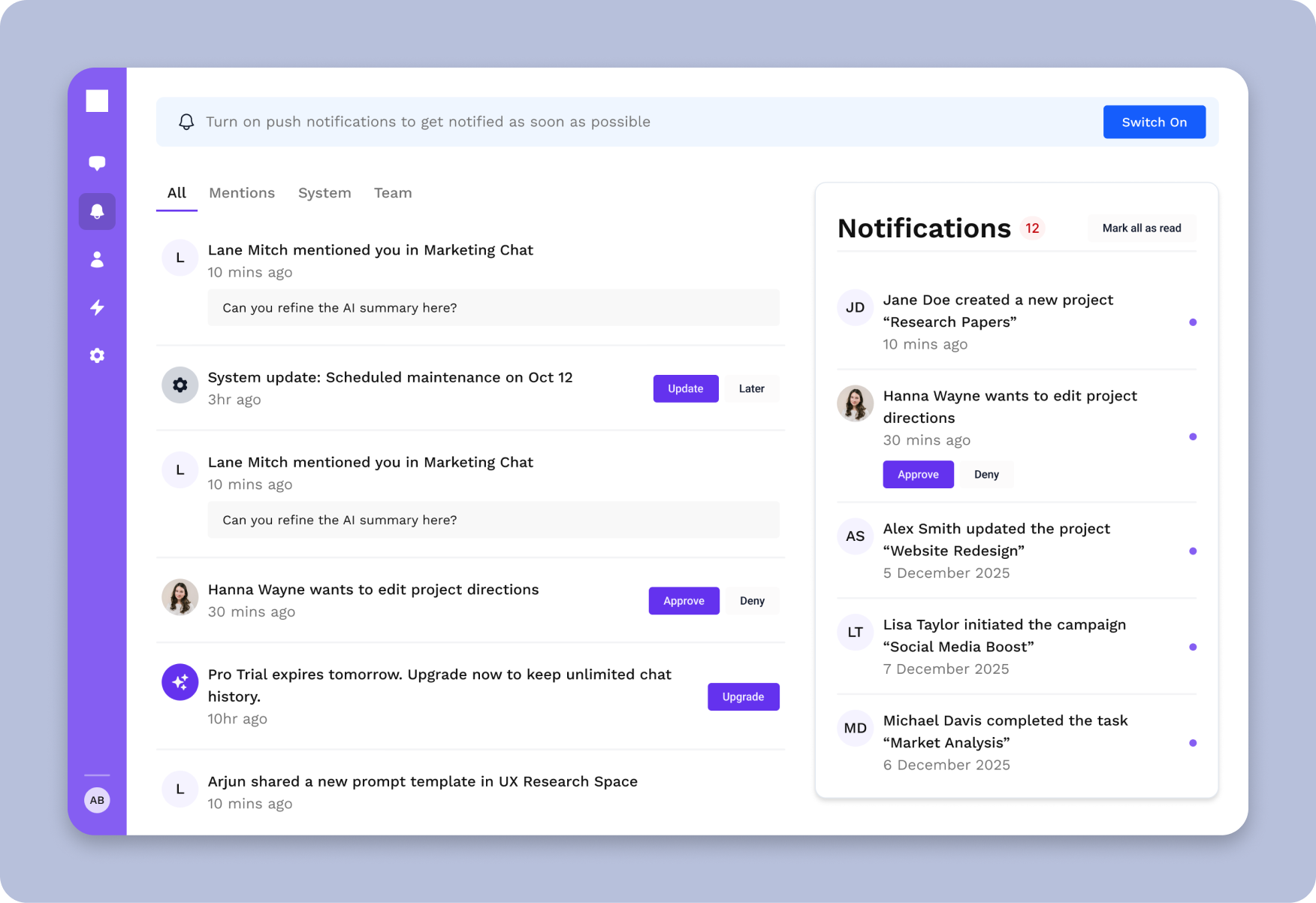
Next.js SaaS billing and subscription management interface
How Next.js SaaS Boilerplate & Starter Kit Compares
See how thefrontkit stacks up against typical alternatives on the features that matter most.
| Feature | thefrontkit | Typical Alternatives |
|---|---|---|
| Auth Screens | Login, signup, recovery, OTP | Varies widely or missing |
| Dashboard Layout | Sidebar + topbar, responsive | Basic layout only |
| Data Tables | Sort, paginate, keyboard nav | Basic rendering |
| WCAG AA Accessibility | Built-in from day one | Usually missing or partial |
| Production-Ready Architecture | Complete app screens included | Rarely available |
| Dark Mode | Token-driven, system-aware | Basic toggle or missing |
| shadcn/ui + Radix | Native integration | Custom or Material UI |
| Production-Ready | Tested, documented, maintained | Often demo-quality |
Pricing Information
Solo License (1 developer)
Full source code. Next.js/Tailwind. Internal projects only.
Team License (Up to 10 developers)
All current + future apps for 1 year. Internal projects only.
Agency License (Unlimited developers, client delivery allowed)
All apps + unlimited client projects. Client delivery allowed.
Pricing Plans
Full source code. Next.js/Tailwind. Internal projects only.
- 1 developer license
- Full source code with production-ready architecture
- Next.js + Tailwind components & demo screens
- 6 months of updates
- Internal projects only
All current + future apps for 1 year. Internal projects only.
- All current + future apps for 1 year
- Full source code with production-ready architecture
- Next.js + Tailwind components & demo screens
- 1 year of updates
- Internal projects only
All apps + unlimited client projects. Client delivery allowed.
- Unlimited developer licenses
- All apps + unlimited client projects
- Next.js + Tailwind components & demo screens
- Priority support
- Client delivery allowed
7 days to wire it to your backend. If the auth flow or settings don't fit your stack, full refund. License upgrades credit 100% of what you already paid.
Launch Your SaaS App With a Real Head Start
The SaaS Starter Kit gives you a tested, accessible, and developer-friendly foundation. Skip the boilerplate and get to building what matters.
Related Articles
View all posts →
How to Build a SaaS in Next.js (2026)
A practical walkthrough of building a production SaaS in Next.js, with the architecture, screens, and accessibility you actually need to ship.

Best Next.js SaaS Starter Kits in 2026
Compare the top Next.js SaaS boilerplates and starter kits in 2026: thefrontkit, ixartz/SaaS-Boilerplate, ShipFast, MakerKit, and more.

How to Choose the Right Next.js SaaS Template in 2026
A practical guide to evaluating Next.js SaaS templates. Learn what to look for, what to avoid, and how to pick a template that won't need replacing in six.
SaaS Starter Kit vs Building from Scratch
Buy a SaaS UI kit or build from scratch? Real time, cost, and risk tradeoffs with concrete examples from the SaaS Starter Kit. Honest analysis.
You Might Also Like
Explore more production-ready business apps.
CRM Dashboard Template
35+ screens with sales pipeline, contact management, and analytics dashboards.
Kanban Board & Project Management Template
44 pages with kanban boards, sprint planning, roadmap, and analytics.
Next.js E-commerce Template
40 screens with storefront, cart, Stripe checkout, and admin dashboard.
Explore Related Templates
Find the right starting point for your project.
Next.js SaaS Template
Production-ready SaaS starter with auth, dashboards & Tailwind
Next.js Dashboard Template
Sidebar navigation, data tables & analytics panels
Next.js Landing Page Template
Hero sections, pricing tables & FAQ components
React Admin Dashboard
CRM, HR & analytics admin panels
Pricing
Compare plans: Free, Single App, All Access, Agency
Frequently Asked Questions
Find answers to your key questions about thefrontkit. Our FAQ section covers licensing, customization, and technical details, ensuring you have everything you need before getting started.