


Citation & Safety Components for AI Chat Interfaces
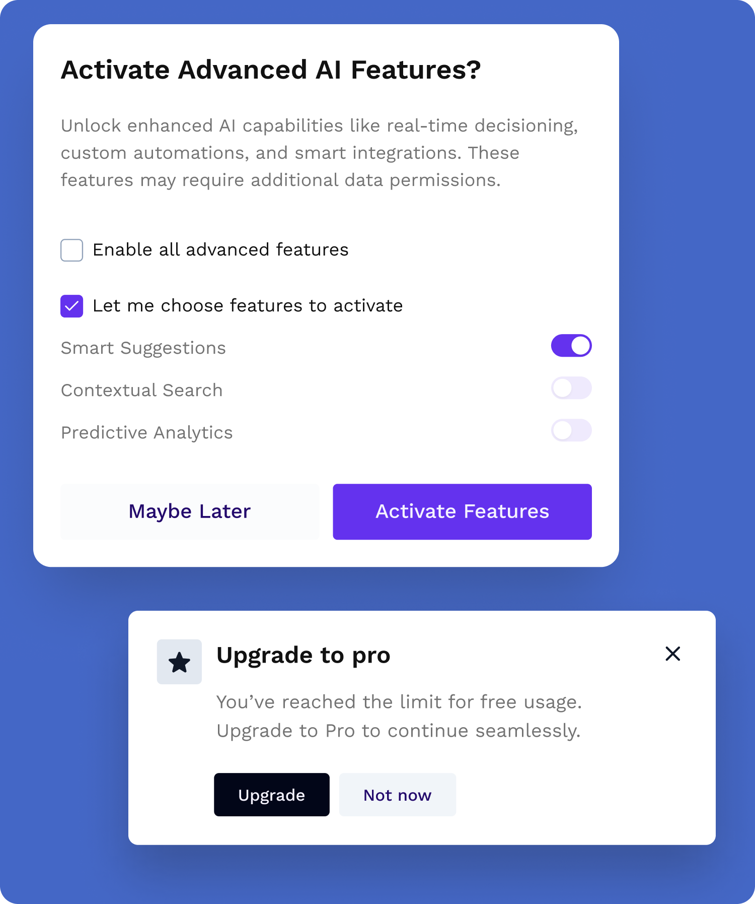
Beyond prompt inputs, streaming responses, and feedback capture, this AI chat UI kit includes citations (clickable source blocks, keyboard-navigable), safety indicators for content moderation and filtered states, and conversation history—session-aware hooks to persist and restore chat threads. These React AI components handle edge cases like network failures and long streaming responses so you focus on your model integration.
WCAG AA Accessible AI Chat Components
AI products that skip accessibility exclude millions of users and often fail procurement for enterprise and government. The AI UX Kit ships with WCAG AA–aligned components and documentation you can reference in RFPs—so accessible AI interfaces are built in, not retrofitted.
See It in Action
The AI Feedback Assistant combines this AI UI kit with the SaaS Starter Kit. See prompt flows, streaming, citations, and ratings in a real app.
View the AI Feedback Assistant →


