CRM Dashboard Examples: 8 Layouts and the Metrics to Track
CRM Dashboard Examples You Can Copy
Most CRM dashboards fail the same way. Someone builds one screen with every chart the CRM offers, the team looks at it for two weeks, and then everyone goes back to asking the sales manager for the number.
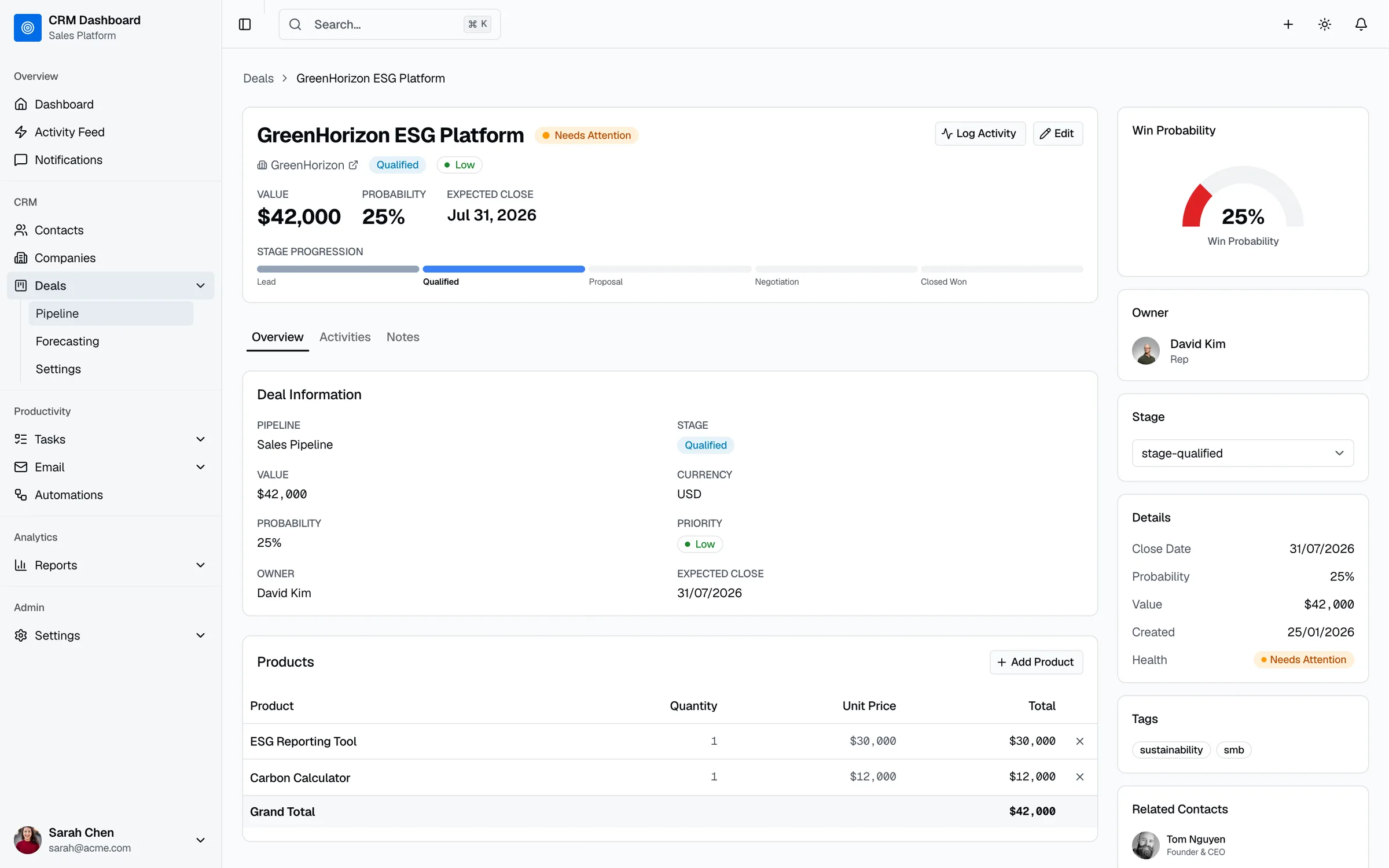
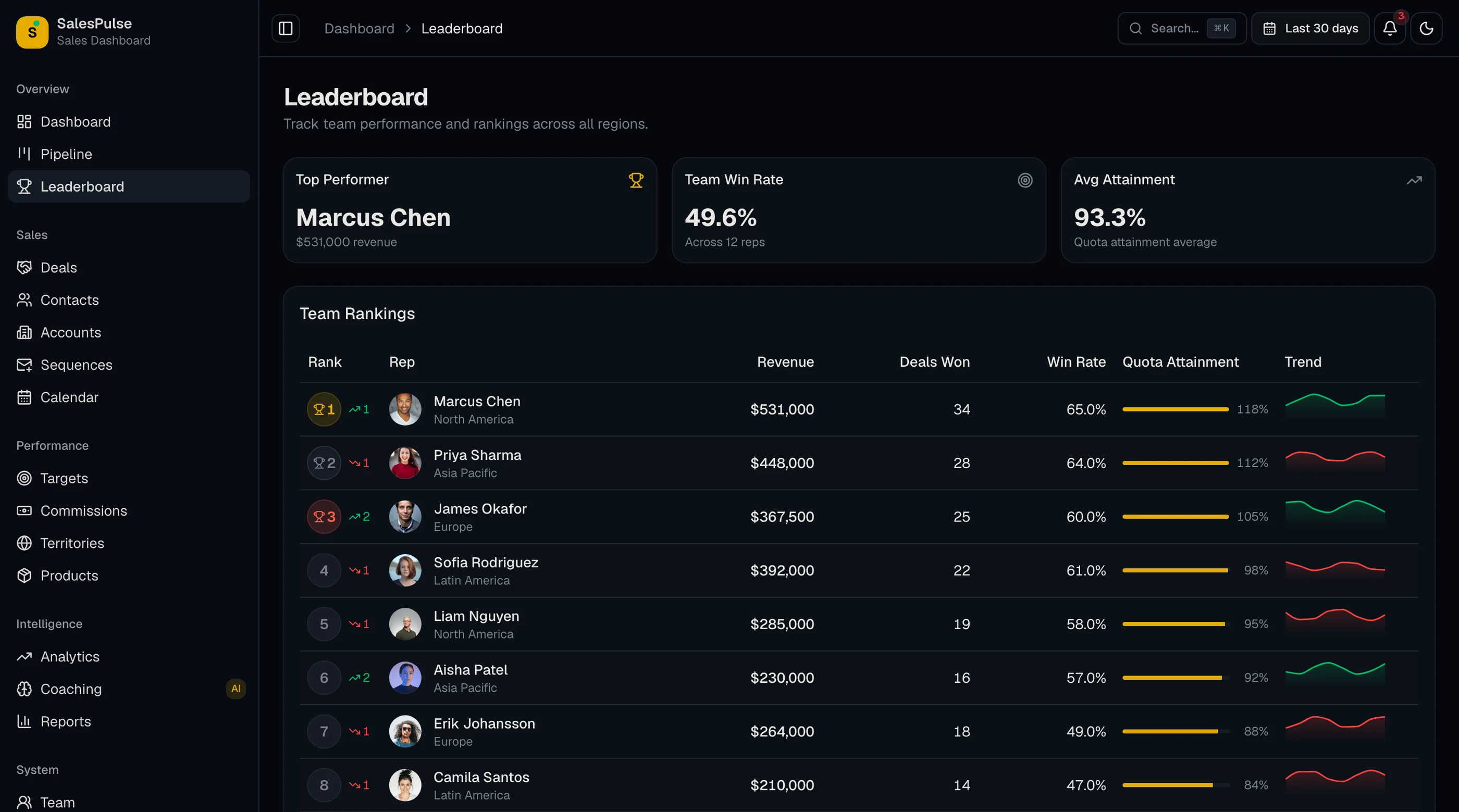
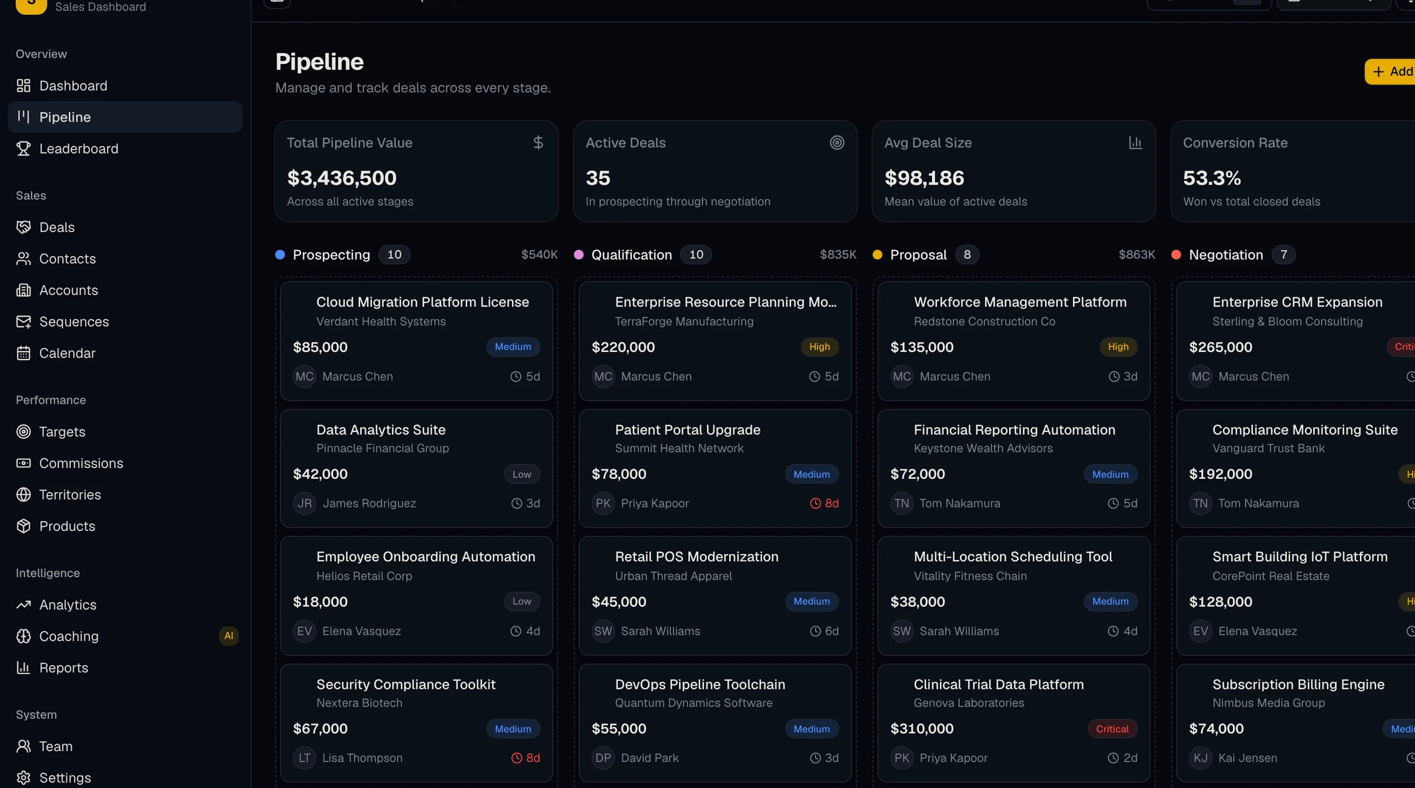
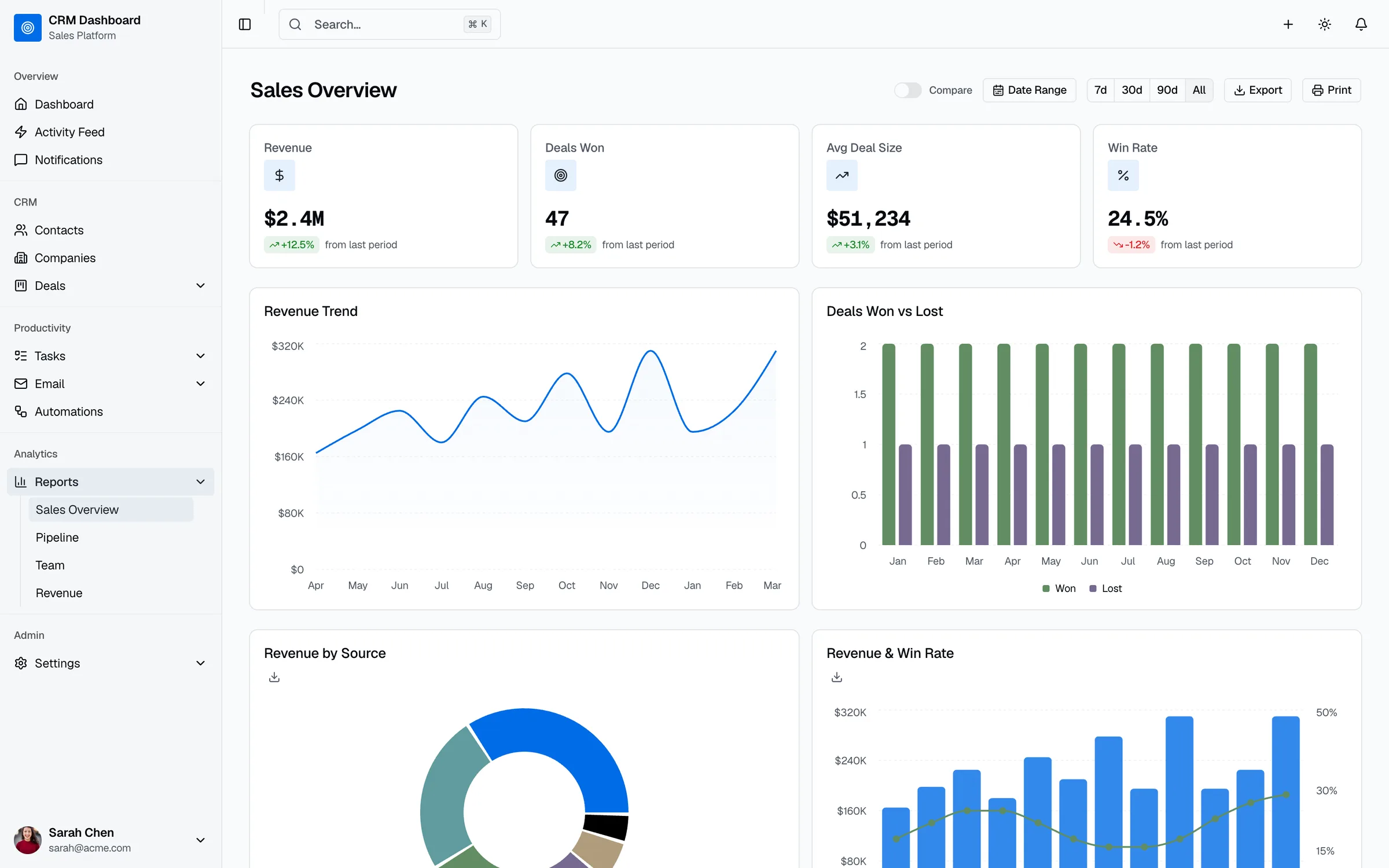
The dashboards that survive are narrow. Each one answers a few questions for one audience, with metrics that someone can act on this week. Below are eight of them, the questions each answers, the exact metrics and formulas to use, and the chart that fits each metric. The screenshots come from the CRM, sales and SaaS metrics dashboards our team builds.
TL;DR
- A CRM dashboard is a single screen of live charts built from your CRM data, so a team can see pipeline, performance and revenue without running reports by hand.
- Build one dashboard per audience: reps, sales managers, leadership, marketing and customer success need different screens.
- The eight examples: pipeline, rep performance, forecast, lead funnel, speed to lead, executive revenue, retention, and data quality.
- Put the data quality dashboard first if your team doesn't trust the numbers. Every other dashboard depends on it.
- Five to seven metrics per dashboard is plenty. If a chart hasn't changed a decision in a month, remove it.
What a CRM Dashboard Is (and How It Differs From a Report)
A CRM report answers one question with one dataset: deals closed last quarter by rep, for example. A CRM dashboard puts several reports on one screen and keeps them current, so you can scan the state of the business in under a minute.
That distinction matters when you build them. Every major CRM builds dashboards out of saved reports: Salesforce dashboard components are based on source reports, HubSpot dashboards are collections of reports, Pipedrive handles both in Insights, and Zoho CRM keeps them in its Analytics module. So the work is really choosing the right reports, then arranging them for the person who has to act on them.
1. Sales Pipeline Dashboard
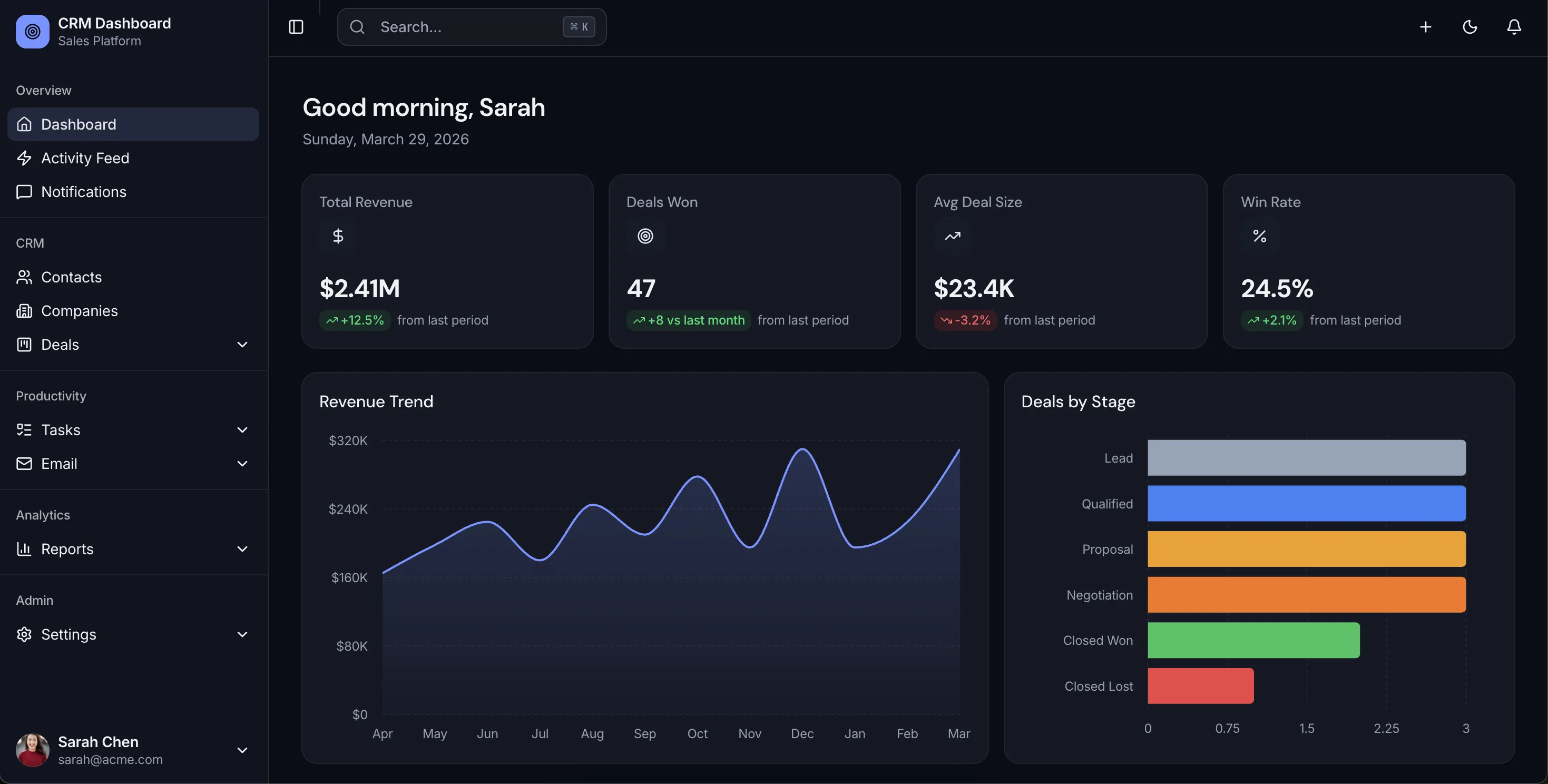
For: sales managers and reps, checked daily.
Answers: How much is in the pipeline, where is it stuck, and which deals need attention today?
| Metric | How to calculate it | Chart |
|---|---|---|
| Pipeline value by stage | Sum of open deal amounts, grouped by stage | Horizontal bar |
| Weighted pipeline | Sum of (deal amount × stage probability) | Single number |
| Stage conversion rate | Deals that moved to the next stage ÷ deals that entered the stage | Funnel |
| Average days in stage | Mean days deals have spent in their current stage | Bar, with a target line |
| Stalled deals | Open deals with no activity in your chosen window (for example, 14 days) | List with owner |
Common mistake: showing total pipeline value without weighting. A pipeline full of early-stage deals looks healthy right up until the quarter closes.
2. Sales Rep Performance Dashboard
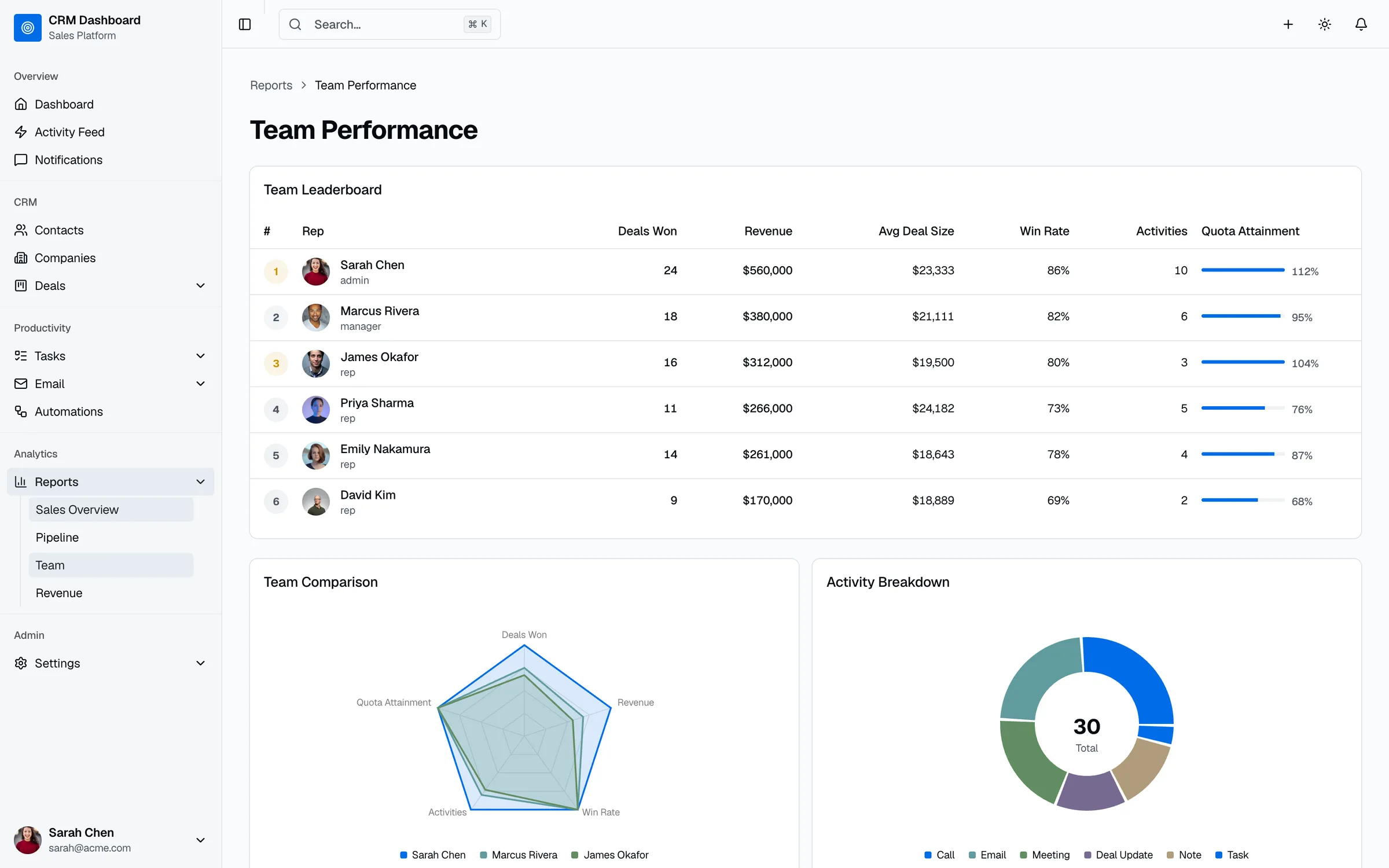
For: sales managers in weekly one-on-ones.
Answers: Who is on track, who needs help, and is the problem activity or conversion?
| Metric | How to calculate it | Chart |
|---|---|---|
| Quota attainment | Closed-won revenue ÷ quota for the period | Progress bar per rep |
| Win rate | Deals won ÷ (deals won + deals lost) | Bar per rep |
| Activities logged | Calls, emails and meetings logged per rep | Stacked bar by type |
| Average deal size | Closed-won revenue ÷ number of deals won | Bar per rep |
| Sales cycle length | Mean days from deal created to closed-won | Bar per rep |
Common mistake: ranking reps on activity count alone. High activity with a low win rate usually points to a targeting or qualification problem.
3. Sales Forecast Dashboard
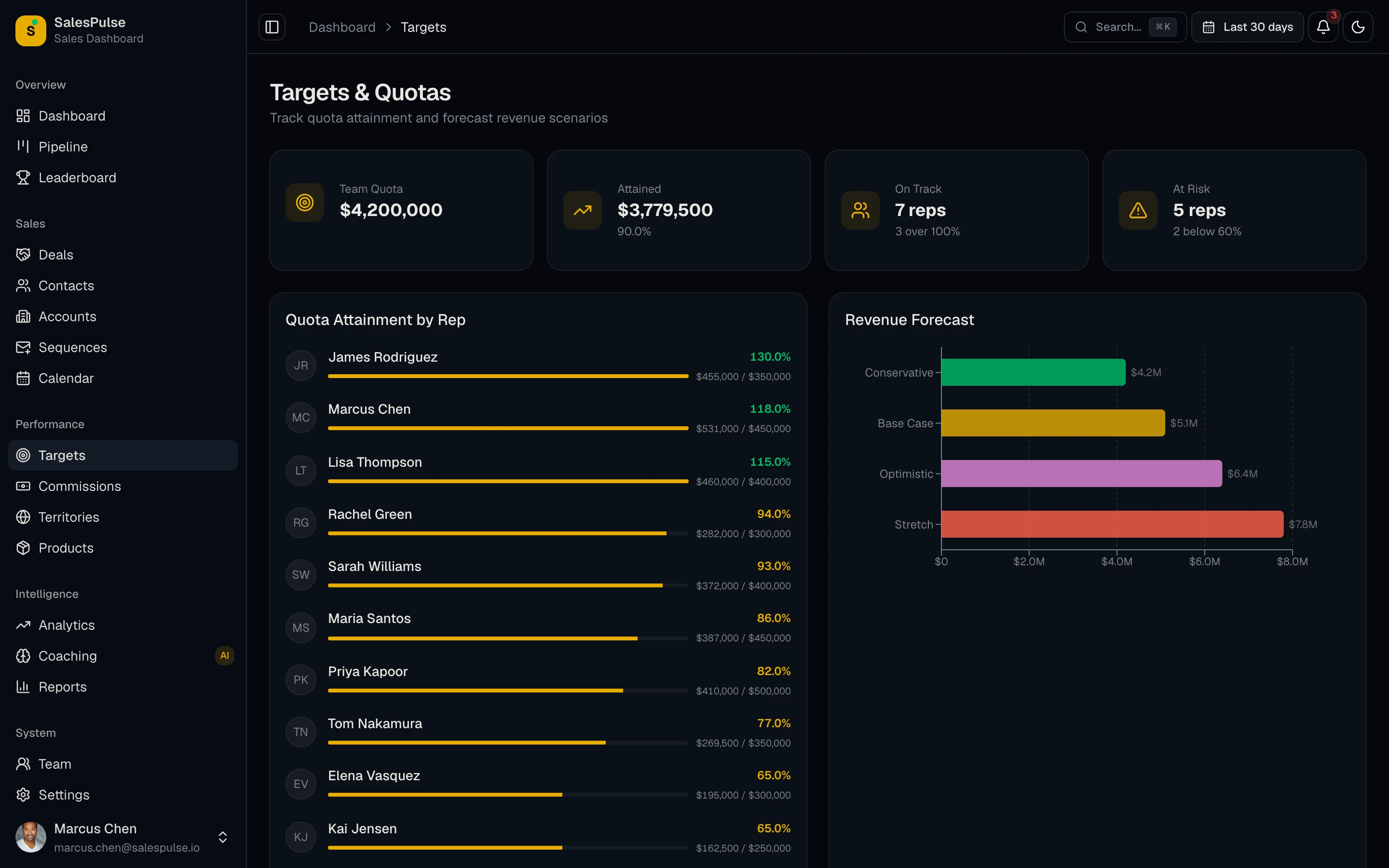
For: sales leadership and finance, reviewed weekly.
Answers: Will we hit the number this month or quarter, and how confident should we be?
| Metric | How to calculate it | Chart |
|---|---|---|
| Forecast vs quota | Closed-won plus weighted open pipeline for the period, against quota | Bar with target line |
| Forecast by category | Deals grouped as commit, best case and pipeline | Stacked bar |
| Deals closing this period | Open deals with a close date inside the period | List with amount and stage |
| Slipped deals | Deals whose close date moved to a later period | Count and list |
| Forecast accuracy | Actual closed-won ÷ forecast at the start of the period | Line over time |
Common mistake: trusting close dates nobody maintains. Pair this dashboard with a rule that deals past their close date get updated or closed.
4. Lead and Marketing Funnel Dashboard
For: marketing and sales leadership, reviewed weekly.
Answers: Which sources bring leads that turn into revenue, and where do they drop out?
| Metric | How to calculate it | Chart |
|---|---|---|
| Leads by source | New leads grouped by original source | Stacked bar over time |
| Lead-to-opportunity rate | Leads that became opportunities ÷ total leads | Funnel |
| Opportunity-to-win rate by source | Won deals ÷ opportunities, per source | Bar |
| Revenue by source | Closed-won revenue attributed to each source | Bar |
| Cost per opportunity | Channel spend ÷ opportunities from that channel (needs ad spend data) | Table |
Common mistake: celebrating lead volume. A source that sends half your leads and a tenth of your revenue belongs near the bottom of this dashboard.
5. Speed-to-Lead Dashboard
For: sales managers and whoever owns lead routing, checked daily.
Answers: Are new leads getting an owner and a first touch fast enough?
| Metric | How to calculate it | Chart |
|---|---|---|
| Time to first touch | Median time from lead created to first logged activity | Single number and trend line |
| Unassigned leads | Leads with no owner after one business day | Count and list |
| Leads without a touch | Assigned leads with no activity in your target window | List by owner |
| First touch by source | Median time to first touch, grouped by lead source | Bar |
Common mistake: measuring the average instead of the median. A handful of leads that sat for two weeks can hide the fact that most leads were handled in an hour, or the reverse. If this dashboard looks bad, the fix is usually routing, which our CRM automation guide covers step by step.
6. Executive Revenue Dashboard
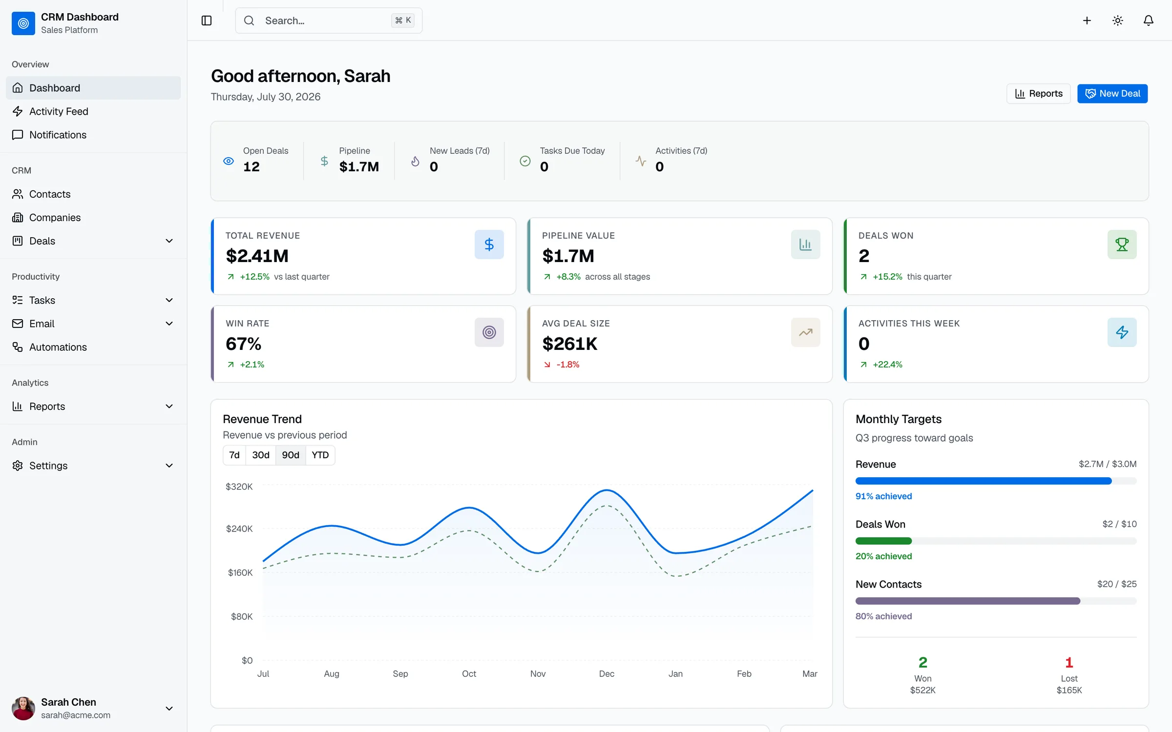
For: founders and leadership, checked weekly.
Answers: How is revenue trending, and is the sales engine getting more or less efficient?
| Metric | How to calculate it | Chart |
|---|---|---|
| Closed-won revenue | Sum of won deal amounts this period vs last period | Single number with change |
| Revenue vs target | Closed-won revenue against the period target | Progress bar |
| Win rate trend | Win rate per month | Line |
| Average deal size trend | Average won deal amount per month | Line |
| Sales cycle trend | Average days to close per month | Line |
Common mistake: loading this dashboard with operational detail. Leadership needs five trends and the ability to click into the pipeline dashboard when something moves.
7. Customer Retention Dashboard
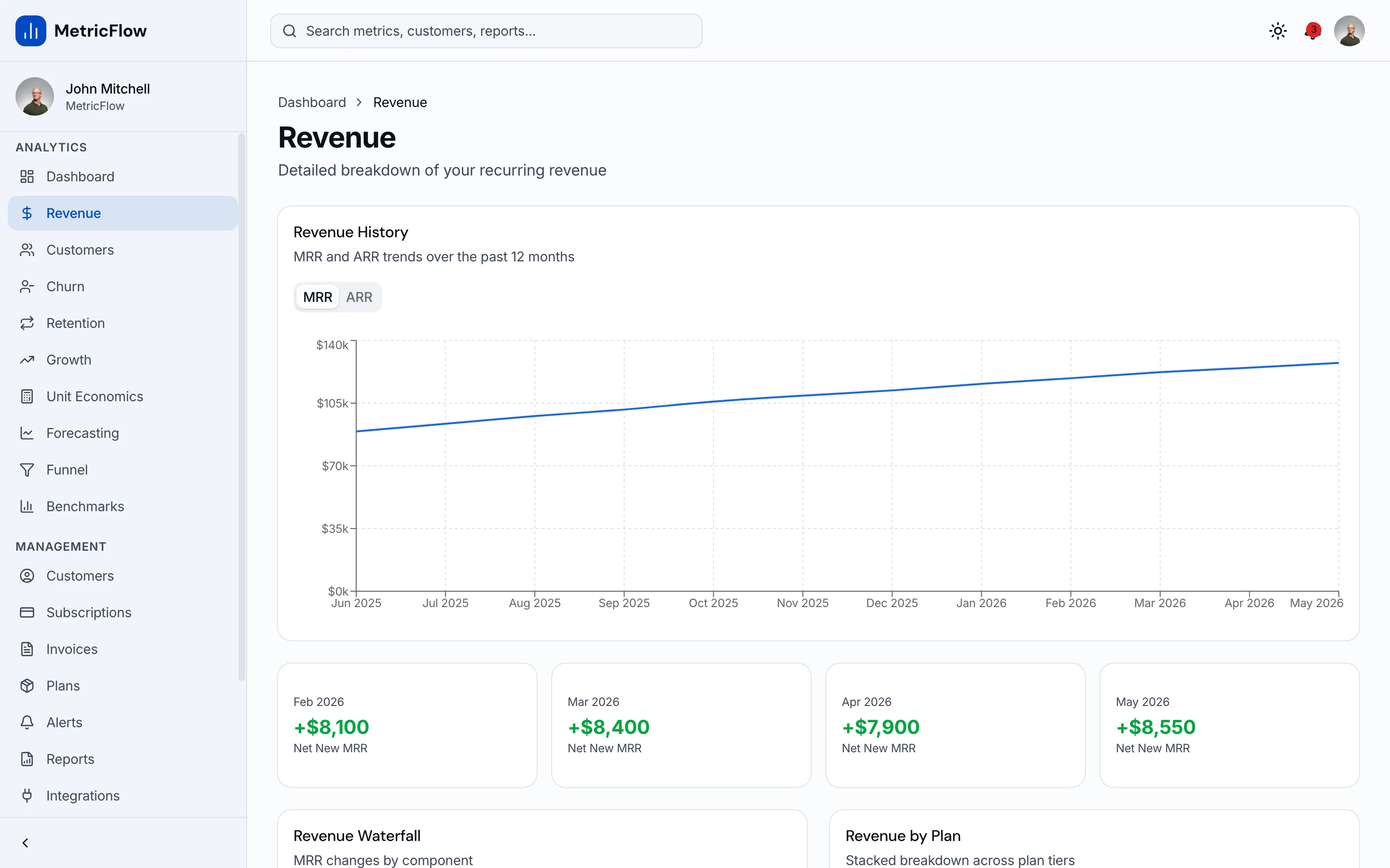
For: customer success and founders of subscription businesses, reviewed monthly.
Answers: Are customers staying and growing, and who is about to leave?
| Metric | How to calculate it | Chart |
|---|---|---|
| Customer churn rate | Customers lost in the period ÷ customers at the start | Line |
| Net revenue retention | (Starting recurring revenue + expansion − contraction − churn) ÷ starting recurring revenue | Single number and trend |
| Renewals due | Contracts renewing in the next 90 days, with value and owner | List |
| Retention by cohort | Share of each signup month's customers still active | Heatmap |
| At-risk accounts | Accounts flagged by low usage, open escalations or missed check-ins | List |
Common mistake: keeping renewal dates only in a billing tool. If the CRM doesn't know when a contract renews, nobody gets a task until it's too late.
8. CRM Data Quality Dashboard
For: the CRM admin or operations lead, reviewed weekly. For many teams, this one should come first.
Answers: Can we trust the numbers on every other dashboard?
| Metric | How to calculate it | Chart |
|---|---|---|
| Duplicate records | Contacts or companies sharing an email or domain | Count and trend |
| Deals missing key fields | Open deals without an amount, close date or next step | Count by owner |
| Deals past close date | Open deals whose close date has passed | List by owner |
| Contacts without an owner | Contacts with no assigned owner | Count |
| Sync errors | Failed records from integrations with billing or marketing tools | Count by source |
Common mistake: building forecast dashboards on top of messy data. When two tools create the same contact, or close dates never get updated, every chart above inherits the error. Our CRM integration audit starts with exactly these checks: duplicates, sync rules and errors on both sides.
CRM Metrics Cheat Sheet
| Metric | Formula | Dashboard |
|---|---|---|
| Win rate | Deals won ÷ (won + lost) | Rep performance, executive |
| Average deal size | Closed-won revenue ÷ deals won | Rep performance, executive |
| Sales cycle length | Mean days from created to closed-won | Rep performance, executive |
| Weighted pipeline | Σ (deal amount × stage probability) | Pipeline, forecast |
| Stage conversion | Deals moving to next stage ÷ deals entering stage | Pipeline |
| Quota attainment | Closed-won revenue ÷ quota | Rep performance, forecast |
| Lead-to-opportunity rate | Opportunities ÷ leads | Lead funnel |
| Time to first touch | Median time from lead created to first activity | Speed to lead |
| Churn rate | Customers lost ÷ customers at period start | Retention |
| Net revenue retention | (Start + expansion − contraction − churn) ÷ start | Retention |
Rules That Keep Dashboards in Use
One audience per dashboard. A rep and a CFO need different screens. Mixing them produces a dashboard neither opens.
Put the number that drives action top left. People read dashboards like a page. Revenue vs target or stalled deals should come first, with detail below.
Show the change next to the total. "$420,000 in pipeline" means little on its own. "$420,000, down 12% from last month" starts a conversation.
Make every chart clickable into records. When a number looks wrong, people need the list of deals behind it. A chart they can't drill into becomes a chart they stop trusting.
Review the dashboard, not just the data. Once a quarter, remove any chart that hasn't prompted a decision. We wrote about why sales dashboards stop getting opened after six weeks, and clutter is most of it.
Building CRM Dashboards in HubSpot, Salesforce, Pipedrive and Zoho
Your CRM's built-in reporting is the right place to start, because the data is already there and your team already logs in.
- HubSpot: build or pick reports from the report library, then add them to a dashboard. Which reports and how many dashboards you get depends on your plan tier.
- Salesforce: create the reports first, then build a dashboard whose components each use a source report. Check the running user setting so people see the data they should.
- Pipedrive: use Insights to create reports on deals, activities and revenue, then group them into dashboards.
- Zoho CRM: use the Analytics module to create dashboards from components built on your modules.
Built-in dashboards run out of room when the numbers come from several tools (CRM, billing, product usage, support), when you need calculations the report builder can't express, or when customers or partners need their own view. That's when teams build a custom dashboard on top of their data.
When a Custom CRM Dashboard Makes Sense
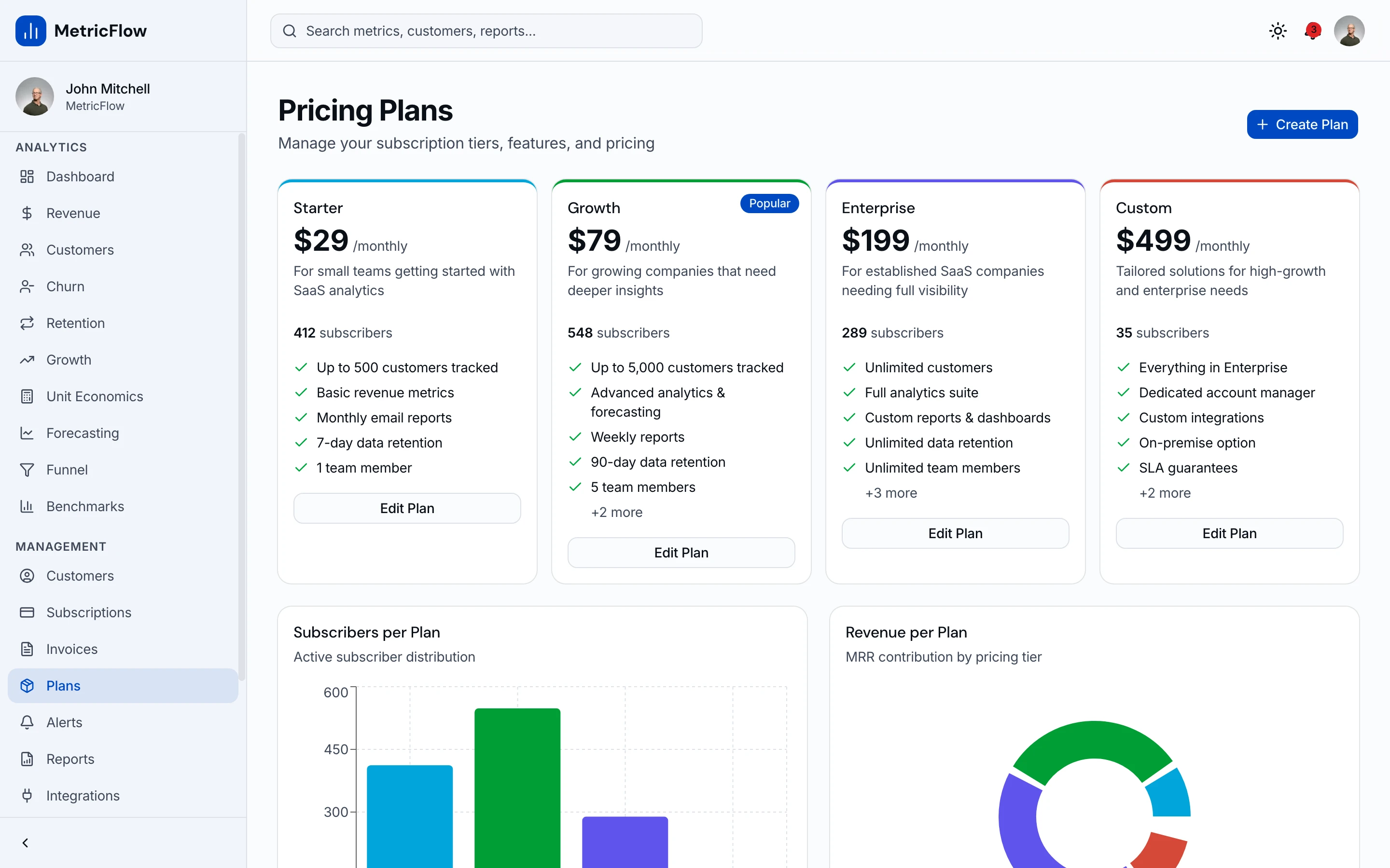
If you're building dashboards into your own product or internal tool, starting from existing screens saves weeks. Our CRM Dashboard Kit includes the pipeline, sales dashboard, reports and leaderboard screens shown above, and the Full-Stack CRM Kit adds a Supabase backend with auth and row-level security. For revenue and retention views, the SaaS Metrics Kit covers MRR, churn and cohorts.
If you'd rather not build it yourself, our team sets up reporting inside the CRM you already use through HubSpot consulting and workflow automation, and builds custom dashboards and portals as SaaS and MVP development projects.
Frequently Asked Questions
What is a CRM dashboard?
A CRM dashboard is a screen of live charts and numbers built from your CRM data. It lets sales, marketing and leadership see pipeline, performance and revenue at a glance, without running individual reports.
What should a CRM dashboard include?
Five to seven metrics for one audience. A sales pipeline dashboard, for example, needs pipeline value by stage, weighted pipeline, stage conversion, average days in stage and a list of stalled deals. Leave out anything nobody will act on.
What is the difference between a CRM dashboard and a CRM report?
A report answers one question from one dataset, like deals closed last quarter by rep. A dashboard combines several reports on one screen and keeps them current, so you can see the overall picture quickly and click into the detail.
What are the most important CRM metrics?
For most sales teams: win rate, average deal size, sales cycle length, weighted pipeline, stage conversion rates, quota attainment and time to first touch. Subscription businesses should add churn rate and net revenue retention.
How do I create a dashboard in Salesforce or HubSpot?
In Salesforce, build the reports first, then create a dashboard and add components that each use one of those reports as their source. In HubSpot, create or choose reports from the report library and add them to a dashboard. Available reports and dashboard limits depend on your plan.
Can I build a custom CRM dashboard?
Yes. Custom dashboards make sense when data comes from several tools, when you need calculations your CRM's report builder can't handle, or when customers need their own view. Starting from existing dashboard screens and connecting them to your data is much faster than designing every chart from scratch.
Want it shipped without hiring a developer?
The build path above assumes you have engineers. If you don't, the team behind thefrontkit does done-for-you launches: we deploy the kit, apply your branding, and wire it to your stack. Fixed quotes, most builds ship in 2-4 weeks, from $1,999.